Want to get the inside scoop on the home trends that are going to be big in 2022?
Interior stylist Laura Brown gives us all the tips and tricks you need to know in this interview! Read on to find out more…
Laura Brown is an experienced UK stylist, with over 20 years in the industry. She has a strong background in creative media and arts, and has worked in areas such as TV, Ad campaigns, photography for home and lifestyle magazines and more!
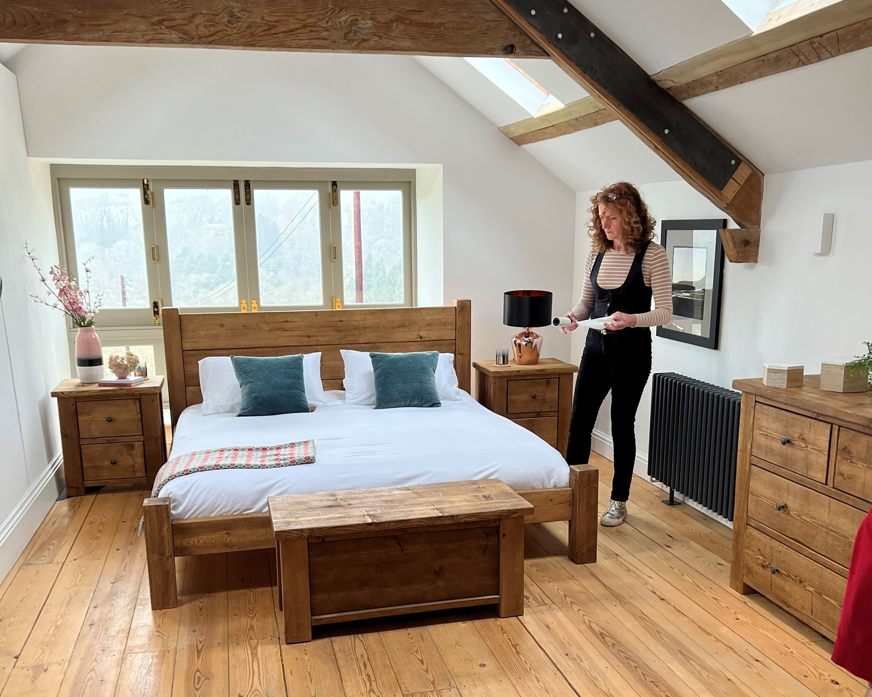
We have collaborated with Laura on several occasions, with her beautiful styling featuring in a number of our photoshoots. While shooting for our Langley Oak range, we stopped for a quick coffee break and caught up with her to find out exactly what to expect from interiors this Summer. She gave us tips on what colours to combine to achieve a light and airy feel in the home, to interior trends that have been overdone and should move on from this year.
1. Do you have any tips you can share with us on how to introduce a bright and lighter feeling into the home for this Summer?
Summery homes are all about introducing a fresh and airy feeling which will bring the space to life.
You can create that bright and light feeling in your home with a few simple changes to your accessories and styling. You don’t need to spend a fortune, quite often it’s about refining what you already have in your rooms.
Create contrast in your room, it’ll help pieces to ‘pop.’ Place lighter coloured furniture or accessories in front of a deeper coloured wall, to create a statement and make them standout more. This is a great trick for adding brightness and lightness to even the darkest of rooms.
When it comes to dressing your windows, choose natural fabrics with smaller patterns such as printed cottons, light voiles and sheerer materials.
And of course, bringing in some nature always help too. So, add in florals and greenery to your scheme, whether that’s real flowers in vases, or in a printed wallpaper or soft furnishings. They always add extra life and light.

2. What would you say are your top tips for styling a home setting for a photoshoot?
One thing that can be really tricky when it comes to interior design is getting a good balance between homely and co-ordinated rooms. We all have inherited ornaments and pictures that we don’t want to part with and trying to incorporate them within your scheme can make the room feel less cohesive. Another common mistake is over styling, its easy to feel that every space needs a feature, so it’s important to step back and think about the look you are trying to achieve before going too crazy with accessories.
Try not to obsess over colour matching exactly. It’s hard to not fall into this trap, as often we feel that colours must go perfectly together to work well, but that’s not always the case. Instead, try breaking down complimentary colours into their two parts. For example, an orange lamp could be co-ordinated with a cushion that has reds and yellows. By doing this, you will add extra dimension and layers to your scheme which will create more impact.
Experiment with placing your furniture in different spaces within your room. Try to not be tempted to push everything against the wall, bringing pieces away actually gives your furniture room to breathe and exist within the space. This also works well within smaller rooms to create an illusion that the area is bigger than it is.

3. What would you like to see more of in-home photography? Is there anything particularly overdone or had its day product or style wise?

4. What do you think is the biggest/most common home interiors trend for 2022?
Natural, earthy tones such as rusty reds, deep ochre and rich greens are a huge trend for 2022 as they help to create a rich and opulent space. Bring them into your scheme by going bold with a statement wall colour or style up a space with accessories.
Another thing we have seen a lot of so far in 2022 is layering. This is a great technique to elevate a design and create more interest. This trend is only going to continue through the year, and we can expect to see lots more oversized, organic patterns and tribal prints within interior design schemes.

Wondering what to read next? How about our Top 5 Garden Hacks? Or our Top Tips For Neutral Living Rooms.
Share:
Top 5 Money Saving Garden Hacks
How To Style A Hall Table